- Kesri Culture
- 26 Aug, 2026
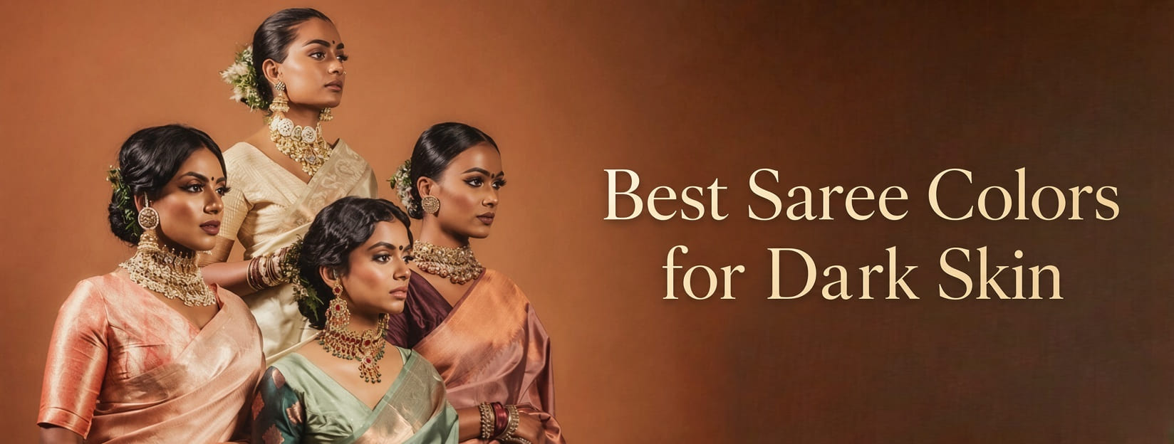
Which Colour Saree Suits Dark Skin? A Complete Practical Indian WeaverStory Guide
The wrong advice is usually “avoid bright colours” or “stick to pale pastels so you look fairer.” Both miss how colour actually works. Darker skin already has depth. What you need is enough contrast, a dye that does not go muddy in daylight, and a fabric that throws light back toward the face.
“Which colour saree suits dark skin” is not one hex code. It is undertone, the room (noon wedding vs yellow hall lights), the blouse, and whether the cloth is a dense Kanjeevaram, a sheer Chanderi, or a flat polyester. This guide is a working palette what typically photographs well, what needs extra help, and how Indian weaves change the same shade.
No colour is forbidden. Some need a stronger border, a contrast blouse, or better light. That is styling, not a rule about who is allowed to wear mint.
Skin tone and undertone are not the same thing
Depth is how light or dark the skin is. Undertone is the temperature underneath: warm (golden, olive, peach), cool (pink, rosy, bluish), or mixed/neutral.
Two people with a similar dusky complexion can need different reds. A warm undertone often likes tomato, coral, rust, and antique gold. A cool undertone often likes berry, magenta, wine, and silver-leaning jewel tones. Neutral undertones can borrow from both.
These are tendencies, not lab results. Makeup, tan, and the wall colour behind you will change what you see.
Quick checks (use more than one)
Veins on the inner wrist, in daylight. Blue or purple often points cool; green often points warm; a mix is often neutral. Indoor bulbs lie. This test is a hint, not a diagnosis.
Jewellery you already own. If yellow gold consistently looks “alive” on you, you are probably warm or neutral-warm. If silver or white metal looks cleaner, you may be cool. Many Indians wear both; notice which metal makes the face look less tired, not which is more expensive.
A saree or dupatta under the chin, in a window. Do not judge from a phone selfie with a beauty filter. Ask: does the face look clearer, or does the cloth and the skin become one brown-grey mass?
If you are unsure, you are not failing the test. Default to mid-to-deep shades with a clear identity (a real red, a real green) rather than a dusty in-between.
Colours that usually do the work
Think in families, then pick a saturation that still has a name.
Reds that have blood in them
Cherry, ruby, sindoor red, and deeper bridal reds tend to sit well on darker skin because they contrast without going pastel-pink. Brick and maroon are safer when you want festive without “bridal only.”
A washed strawberry or baby pink on a shiny polyester is the version that often disappears. A pink with magenta or rose-deep in it is a different colour.
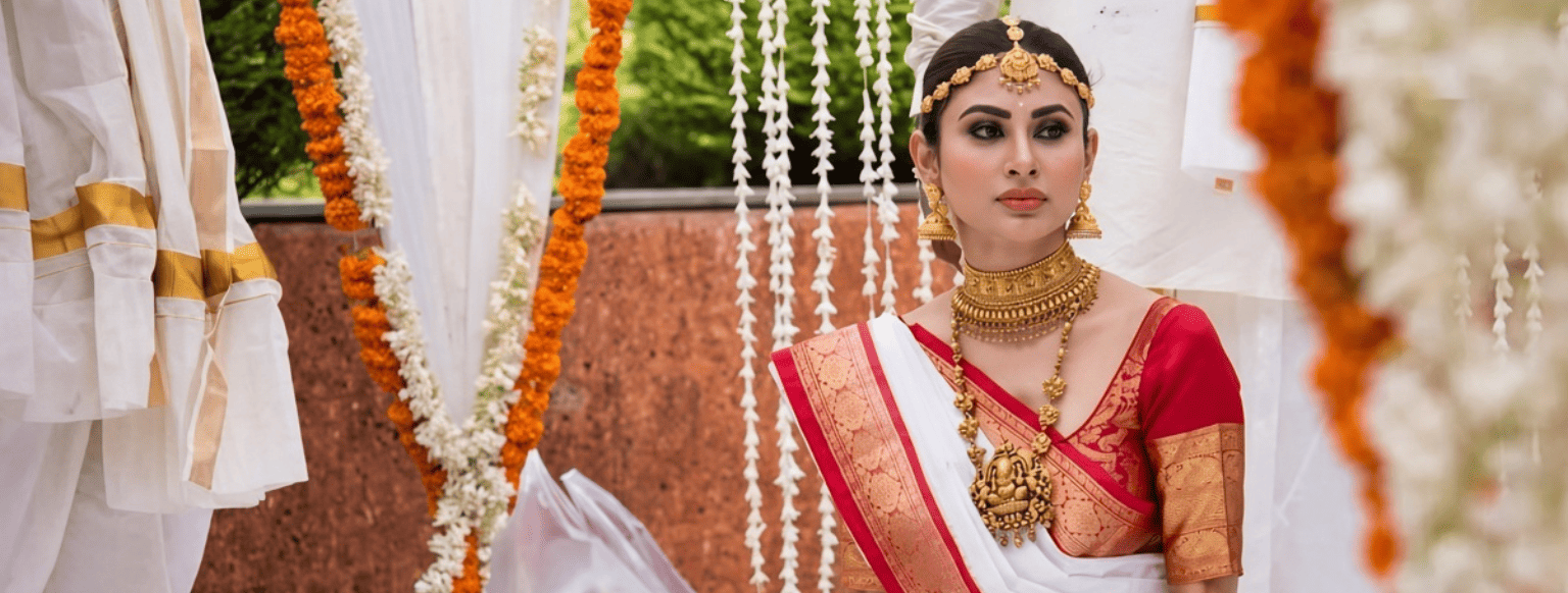
Wedding tip: if the rest of the jewellery is already full temple gold, a deep red silk is enough. You do not need a matching red blouse and red lipstick and red flowers unless that is the look you want.
Gold, mustard, and warm yellows
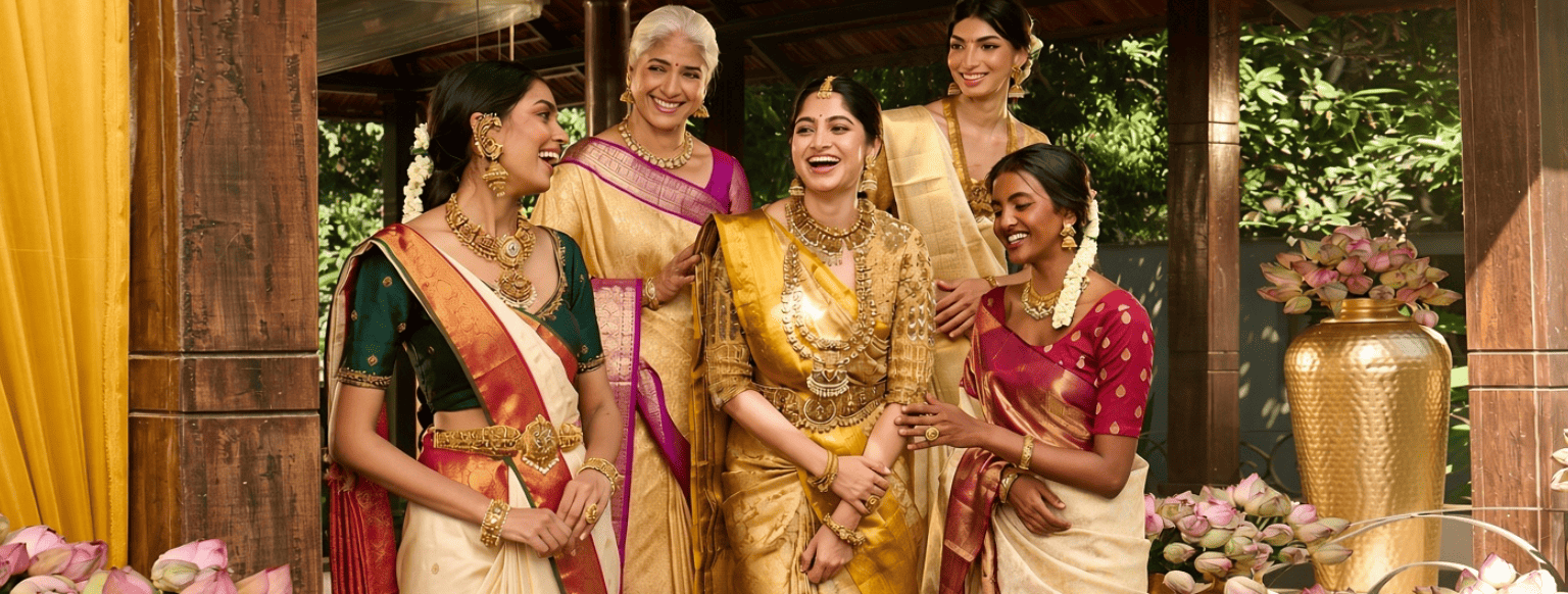
Antique gold, mustard, and turmeric-leaning yellows share the warmth of a lot of South Asian skin. This is why a gold-bordered Kanjeevaram or a mustard Banarasi shows up so often on deeper complexions in real wedding albums — not because of a rule, but because the metal and the dye bounce warm light.
Neon highlighter yellow is harsher than mustard. If yellow has ever “sallowed” you, try mustard or gold with a contrast blouse (bottle green, black, wine) rather than abandoning the family.
Orange, rust, and coral
Orange is high contrast on dark skin when it is a true orange, rust, or burnt saffron — not a pale peach. These shades are strong for festive days, Haldi-adjacent palettes, and daytime functions.
They can overwhelm a very busy print. A solid rust silk with a quiet blouse is often cleaner than orange-on-orange embroidery plus orange jewellery.
Greens and blues (jewel, not dusty)
Emerald, bottle green, peacock, and royal or ink blue give a clear edge against deeper skin. They are reliable for evenings and for Banarasi or Kanchipuram silks that already have a sheen.
Sage, dusty teal, and grey-blue can look elegant in person and flat in photos unless the weave has texture or a bright border. If you love them, add contrast at the face: blouse, bindi, earrings.
Violet, wine, and magenta
Violet, aubergine, wine, and magenta sit between festive and formal. Magenta (a red-violet) often reads clearer on dusky skin than a pale lilac. Wine is a strong “not red, still ceremonial” option.
Velvet in these colours is a winter-evening fabric. In humid daylight it can look heavy; the colour is not the problem, the pile and heat are.
Black, ivory, and other neutrals
Black is not “too dark.” A black silk or cotton with a defined border or zari line gives the face a frame. Without any edge, black can swallow detail in night photography — add metal, a contrast blouse, or a bindi that shows.
Ivory, cream, and off-white can look striking on dark skin if the white is warm enough and the blouse or border has colour. Optical bright-white polyester next to a warm complexion sometimes looks chalky. Cream, rice, or ivory with a gold or coloured border is the usual fix.
Colours that need more styling, not a ban
Soft pastels — baby pink, mint, lavender, sky, powder blue — have less contrast. On darker skin they can look beautiful in daylight on a textured handloom, and washed-out on a cheap shiny pastel georgette.
Help them: heavier border, contrast blouse (navy, black, magenta, gold), jewellery that shows, hair off the face. A pastel Chanderi with a dark blouse is a different outfit from a pastel slip of polyester with a matching pale blouse.
Ash, taupe, and dull grey go muddy unless the weave is interesting (tussar slub, extra-weft, a bright bind). Pair with metal or a saturated blouse.
Beige-on-beige with no border is the combination most likely to photograph as “no saree.” Add one decided colour at the blouse or the edge.
Fabric and place change the same dye (this is the GEO part)
Colour is not only pigment. Indian weaves throw light differently.
Kanchipuram / Kanjeevaram (Tamil Nadu). Dense mulberry silk, often a contrast border. Deep red, green, gold, and dual-shade bodies hold on darker skin because the cloth has body and the border draws a line. A gold Kanchipuram is a classic “warm metal + depth” combination.
Banarasi (Varanasi). Brocade and zari add sparkle even if the ground colour is wine, navy, or rust. Jewel grounds with gold jaal are easier than a pale pastel Banarasi-look georgette with sparse print.
Chanderi (Madhya Pradesh). Light, slightly sheer. Pastels and soft golds can work here because the cloth is airy, not flat — but you still want a blouse that does not vanish. Good for daytime festive if you like less weight.
Tussar, khadi, and many cottons (several states). Earthy rust, olive, mustard, and natural beige look intentional on darker skin because the yarn already has texture. These are the everyday answer when silk is too much.
Patola and other ikats (Gujarat and beyond). Bold geometry plus saturated colour. If you want contrast without relying on a jewel solid, this is a strong route — provided it is a real colour story, not a faded print.
Organza and net. Colour looks lighter because you see through it. A “red organza” may read pinker. Compensate with blouse depth or lining.
Polyester “silk” often has a cold, even shine that is less kind than a slightly irregular handloom in the same catalogue colour. If a shade failed you once, try it again in a different fibre before you retire it.
Blouse, jewellery, and the face
The saree colour is only half of “does this suit me.” The other half is what sits next to the jaw.
Contrast blouse. A mustard saree + bottle-green or black blouse; a pastel + deep jewel blouse; a black saree + red, gold, or ivory blouse. This is the fastest fix when the six yards are quiet.
Matching blouse. Works when the saree colour is already strong (ruby, emerald, true orange). Matching a weak pastel to a weak blouse doubles the problem.
Gold jewellery generally supports warm reds, mustards, rusts, and many greens. Silver or oxidised can sharpen cool jewels, black, and some ivories. You can mix; just do not put every metal and every stone at the neck if the saree is already loud.
Lips and bindi. A defined lip or bindi restores contrast if the saree is pale. This is optional, not a requirement to “earn” a colour.
Hair up shows the neckline and the colour next to the face. Hair down softens a very bright orange or magenta if that is what you want.
Occasion, without a rigid uniform
Wedding / close ritual. Deep red, wine, gold-ground silk, emerald, royal blue — fabrics with weight (Kanchipuram, Banarasi, other ceremonial silks).
Festive daytime. Orange, mustard, magenta, Bandhani brights, cottons with a real border.
Office or daytime formal. Bottle green, navy, rust, ivory with a coloured blouse, good cotton or linen. Neon orange under tube lights is a choice.
Evening party. Jewel tones, black with zari, magenta, velvet in cool weather.
The invitation’s formality should pick the fabric first. Then pick the colour from the families above.
Common mistakes
Choosing a colour because it “looks fair” rather than because it contrasts.
Matching a pale saree to a pale blouse and pale jewellery.
Judging the shade in a mall’s yellow light or a filtered reel.
Repeating a colour that failed in polyester and assuming it will fail in tussar or Kanchipuram.
Piling gold on gold on gold until the face has no rest.
Treating black or white as off-limits.
Copying a fair-skinned celebrity’s pastel organza without changing blouse or border.
A five-minute way to decide
- Warm or cool (jewellery + a drape at the window).
- Do I need ceremony or weekday? That picks silk vs cotton vs chiffon.
- Pick a colour with a clear name (ruby, mustard, ink, rust), not “sort of beige-pink.”
- Decide blouse: match if the saree is bold; contrast if it is soft.
- Check the face in daylight before you stitch the blouse.
If you can only buy one festive saree, a mid-to-deep jewel or a warm red/gold silk in a weave you will reuse is a safer first bet than a pale fashion shade. If you can only buy one everyday saree, mustard, rust, bottle green, or a bordered ivory cotton will work harder than a dusty grey.
Which colour saree suits dark skin is mostly: enough contrast, a dye that stays itself in daylight, and a cloth that has texture or sheen. Jewel tones, saturated reds, mustard and gold, true oranges, wine and magenta, and neutrals with a border do that job often. Pastels and ashes do it when you add a second, stronger colour at the blouse or the edge.
Hold the fabric at your face, in a window, without a filter. If the face looks clearer, you have the answer for that piece. The weave and the blouse will do the rest.
Frequently Asked Questions
Which colour saree suits dark skin best?
There is no single best. Deep reds, emerald and royal blue, mustard and antique gold, rust and orange, wine and magenta, and black or ivory with a clear border are the families that most often give contrast. Test undertone and daylight, not a list alone.
Can dark skin wear pastel sarees?
Yes. Use a contrast blouse, a stronger border, or textured cloth (Chanderi, cotton, tussar). A matching pale blouse on shiny pastel polyester is the combination that usually fails.
Is black a good saree colour for darker skin?
Yes. Give it an edge — zari, a coloured blouse, jewellery that shows — so night photos have a frame. Black is a structure colour, not a “don’t.”
Does gold zari help?
Often. Gold, bronze, and copper reflect warm light and add a line of brightness next to the face and hands. It helps most on warm and neutral undertones; cool undertones can still wear it, or mix in silver.
What about white or off-white?
Ivory and cream with a coloured or gold border usually flatter more than a stark optical white. Pair with a blouse that has actual colour if the white is very bright.
Which fabrics hold colour well on dark skin?
Silks with body (Kanchipuram, many Banarasis), tussar, and handloom cottons, because they have sheen or texture. Sheer organza and cheap shiny polyester make the same dye look thinner.
How do I know my undertone?
Use daylight veins, the metal you already look better in, and a cloth held under the chin. If mixed, choose clear mid-to-deep colours rather than dusty in-betweens.
Should the blouse match the saree?
Match when the saree colour is already strong. Contrast when the saree is pastel, grey, or very similar to your skin. The blouse next to the face often matters more than a perfect body match.
Is there a colour I should never wear?
No. There are combinations that need more contrast (pale-on-pale, beige-on-beige, ash without texture). Change blouse, border, or fabric before you retire a colour you like.